
Megan
Langford
The Basic
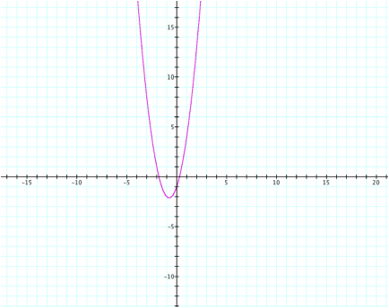
Equation First, let us examine the graph for the equation ![]()
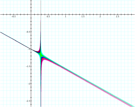
Adding an
xy Term The graph is in the shape of a parabola. We can now see that the vertex is close
to the point (-1, -2). Also, the
hyperbola seems to cross the x-axis near (0.25, 0) and (-1.75, 0). It appears to cross the y-axis near (0,
-1).
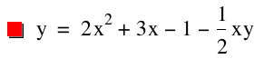
Next, let us examine the
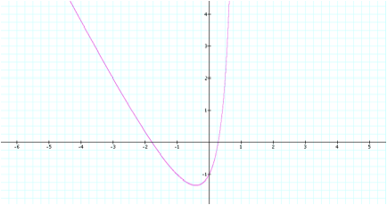
graph for the equation ![]()
At this point, we can point
out a few differences between the graphs.
On the left side, although they both share the same general trend, the
first graph has a much steeper slope.
Near the middle, while the first graph’s vertex appears near (-1, -2),
the second graph’s vertex is closer to (-1/2, -5/4). Finally, on the right side, the slope of the second graph
appears to be steeper than the first.
Although there are these differences, it is also important to note that
both graphs appear to cross the x and y axes around the same points. This would make sense if you consider that
if x or y were zero, then the additional xy term would be equal to zero, thus
giving us the same intercepts for both equations.
However, let us zoom out on
the second graph to notice some additional behavior.
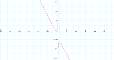
We can now notice that there
is an additional shape below, and this is in fact the graph of a
hyperbola. Another important
observation is that there seems to be an asymptote on the graph located near
x=1, since this seems to be where both shapes sharply curve away from the x
axis. To confirm this we can take
the equation and solve for y in terms of x. So we have:

After examining the equation
in this form, we can now see why there is in fact an asymptote at x=1. If x were 1, then we would have zero in
the denominator, and thus, an undefined y value.
Now to take this analysis
one step further, let us predict what the behavior will be if we add a
coefficient greater than 1 to the xy term. I am going to guess that it will widen both curves, but the
asymptote at x=1 will remain.
Increasing
the xy Coefficient Let’s take a look. We will now graph several equations to
examine the behavior of a positive coefficient to the xy term.
![]()
![]()
![]()
![]()
![]()
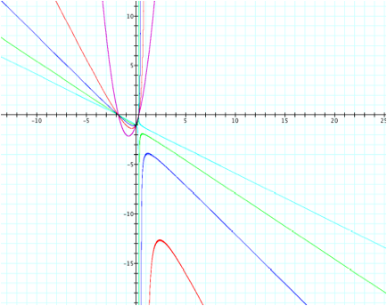
Our prediction proves to
have been accurate to a certain extent.
First we will discuss the curves for the dark blue and green equations,
since the light blue curves have a different shape.
The green and dark blue
curves retain a shape similar to the red one around the asymptote, but widen
out to the sides. We can see this
is because we have increased the value of the xy term by adding the positive
coefficient, thus exaggerating the shape.
Regardless of the wider curves, we can also notice that all three x and
y intercepts appear unchanged with the larger coefficient. This can be explained because at any of
these intercepts, either x or y is set to zero, which means the xy term is gone
from the equation. Since you are
multiplying the coefficient of the xy term by zero in either case, you will
still result with no xy term remaining.
The last subtle difference
in each of these equations we can notice is that the asymptote is slowly
changing. As we increase the
coefficient for the xy term, the vertical asymptote is shifting closer to the
y-axis. This can be explained by
solving for y in terms of x as we did to justify the prior graph.
However, the light blue
curves show that somewhere between the xy coefficients 3 and 4, the curves
change shape completely. Let’s
take a closer look to obtain a more precise estimate of the exact coefficient
where the graph changes shape.
![]()
![]()
![]()
![]()
![]()
We can now see that the
equation best displaying the transition is the green one, since the center of
the x-shape created in this graph is green. This means the xy coefficient that is closest to the exact
value for the actual change in shape is 3.56.
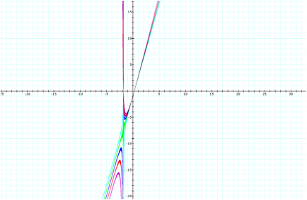
Examining
Negative xy Coefficients Next,
let’s investigate how the graph will change if we give the xy term a negative
coefficient. Let’s also take a
look at what the graph will do if we give the xy term a coefficient whose
absolute value is less than 1. I
am going to predict this will cause the curves to retain their shape but flip
across an axis.
Let’s take a look at the
graph for the functions
![]()
![]()
![]()
Interestingly, this graph
did not end up at all how I predicted.
First, the red function was the one we used to show the behavior of the
graph when the coefficient’s absolute value is less than 1. I chose to use -1/2. The pattern from the original (pink)
equation did seem to continue in this case, but it did tilt the curve slightly
to the right.
The other two equations
actually gave us different hyperbolas altogether. Their shape is almost a somewhat straightened-out version of
the previous hyperbolas.
So this leads us to wonder
where this transformation first occurs.
We know that it happens
somewhere between the xy term coefficients -1 and -1/2. So let’s try some nearby values to
obtain a more precise placement.
![]()
![]()
![]()
![]()
Since the center area of the
shapes is green, we can see the transition occurs close to where the xy term’s
coefficient is -0.56.
Where the
Graph Changes Now, why is it that the
graph changes shape when the xy coefficients are 3.56 and -0.56? We can dig into this a little deeper by
showing the relationship of y in terms of x for both situations.
If the coefficient is -0.56,
we have:
![]()
If the coefficient is 3.56,
we have:
![]()
In fact, if you took this
further, you could probably discover a mathematical explanation for this
behavior.